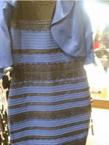
Remember ‘The Dress’ back in 2015? What was your take – white and gold, or blue and black? The discussion divided the internet (and perhaps a few friendships), but it was more than an online sensation: it brought to light how our perception of colours are far from consistent.
In fact, the extent that lighting affects colour matching is a frequently-asked question for Nazdar Ink Answers, a service that offers expert advice to print professionals. As a leading developer of ink, Nazdar Ink Technologies is well placed to help answer tough technical questions like this.
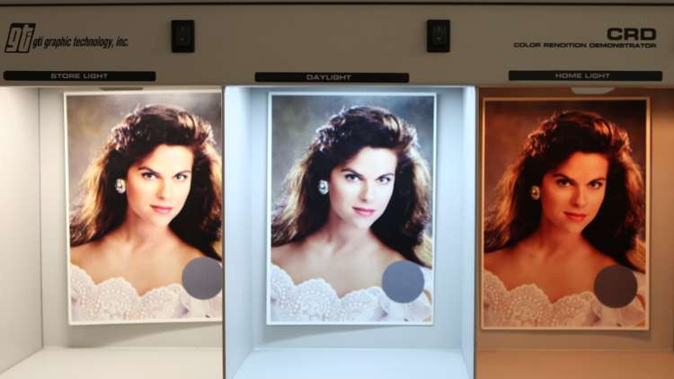
According to Nazdar’s specialists, lighting can have an enormous effect on both a print’s appearance and when colour-matching. You could achieve a good contrast in one type of lighting, then see it washed out in another type, for example. Similarly, a print may have subtle warm tones in one setting and appear overly orange in another.
Ideally, prints would always be proofed in their exact end-use environment – if a print is going to mainly be seen in daylight, it makes little sense to proof its colours under a desk’s fluorescent lighting, for example. However, since this isn’t always feasible, accuracy and consistency of proofing are essential throughout production. Such practices have been set in the ISO 3664 document; by adhering to both the Lighting and Environment standards it describes, you can expect to maintain colour expectations.
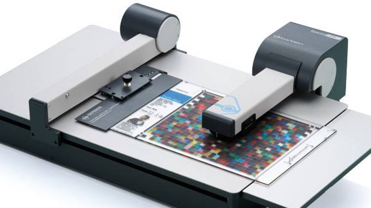
Technology can also help overcome the limits of the human eye. A spectrophotometer can be used to capture and evaluate colour to provide a valuable starting point for colour-matching. However, spectrophotometers can’t always take into account all factors, such as end-use lighting, and can be affected by optical brighteners in substrates and inks, making the reading less reliable.
Moreover, because of differences in substrate and/or ink composition, even colour matches under one light setting can sometimes appear dissimilar under another. Pantone’s Lighting Indicator stickers can help. Under standard D50 Lighting, the two colours appear to match, indicating that your lighting conditions are good for evaluating colour. However, when the lighting condition is changed, the difference between the colours is evident, showing that your light is not optimum for colour-matching. Whatever your end-use lighting conditions, it is important to consistently proof under these settings at each step.
Nazdar also advises its customers to create the best proofing environment they can. All non-target surfaces in the colour-matching area should reflect as neutrally as possible, as to remove even subtle contaminants that can affect your print’s apparent hue. Ensure lightbulbs are evenly spreading light across the area and change lightbulbs regularly for consistent light intensity; remove other light sources, brightly coloured or reflective clothing and other objects from area; and paint walls the ISO-standard neutral grey.
By maintaining strict colour-matching standards and accounting for lighting’s influence, colour can be accurately managed throughout the print process – meaning no arguments over whether your print is white and gold, or blue and black.
For questions on colour-matching or other print-related topics, contact the Nazdar ink experts at InkAnswers@nazdar.com. For more information on Nazdar, please visit www.nazdar.com.